The home that keeps up with Galena’s new vision
A new home and navigation that bring Galena’s strongest features to the front.
- Role
- Senior Product Design Consultant, the only product designer
- Client
- Galena, an education benefits platform for companies
- Period
- Apr 2026 – today · client rollout planned for Jan 2027
- Platforms
- Responsive web
- Team
- 1 PM, 1 tech lead, 3 developers
- Results
- In progress: implementation started
- Links
- Galena
About the client
Galena is an education benefits platform. Companies sign the contract, and their employees get courses from different schools at more accessible prices, to grow in their careers. More than 500,000 courses are mapped on the platform.
Some of its features are strong selling points for new clients. But the usage data showed that people barely used them.
So I proposed a redesign of the home and the navigation, built around what the platform does best.
What I’ll measure
Feature engagement
Individual development plan, daily knowledge dose and catalog access
Mixpanel, after the Jan 2027 rollout
Time on home
Mixpanel
Most-clicked items
to keep adjusting the home
Mixpanel
Baseline: current cards and features, measured before launch. Source for the 500,000 courses: galena.com, Nov 2026.
The challenge
The features that helped sell Galena were the ones employees used least.
Nobody asked for a redesign. I raised the problem myself, with the usage data and in conversations with the product team.
As the only product designer, I proposed and designed the new home and navigation for responsive web, working with a PM, a tech lead and three developers.
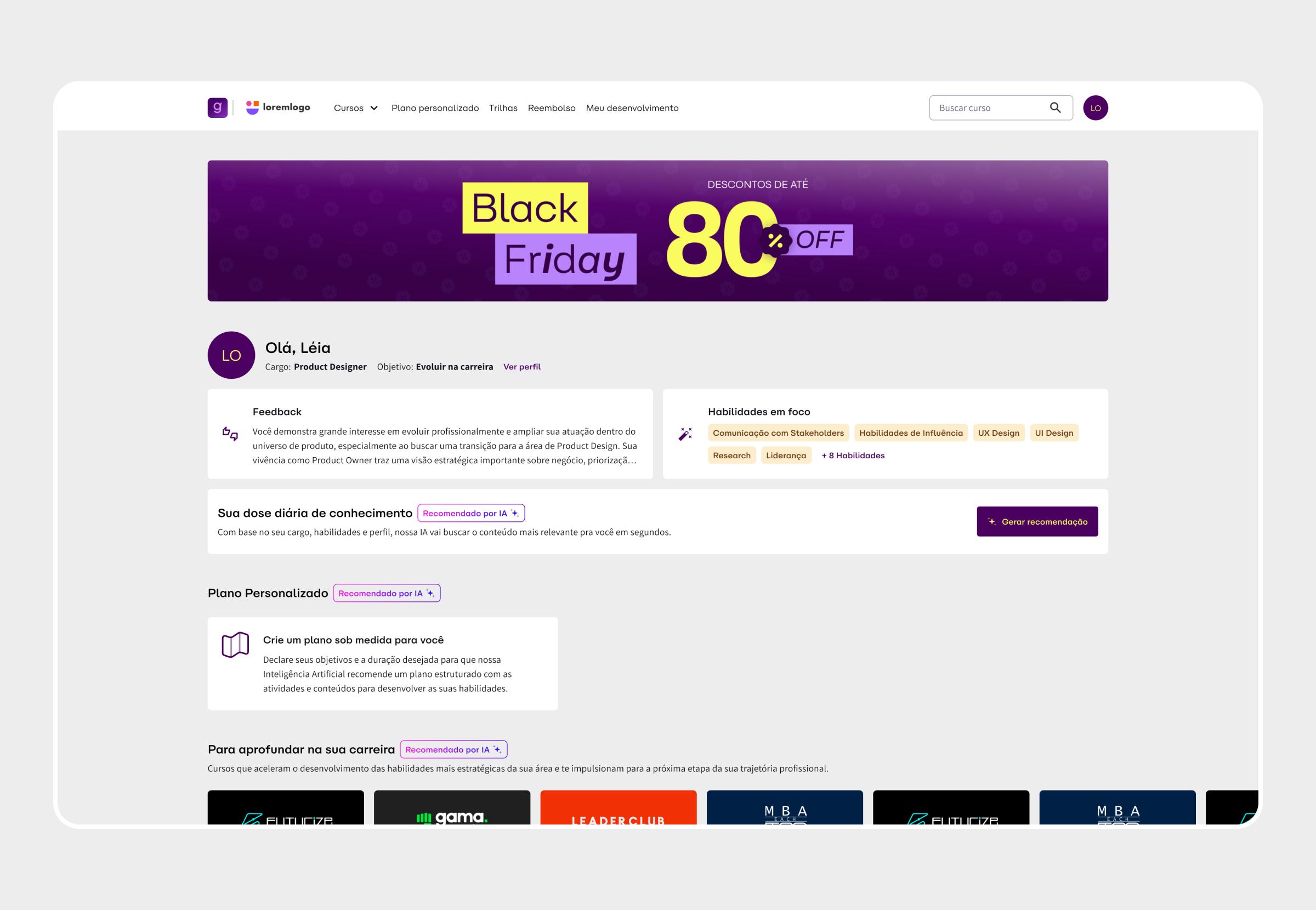
Lighter cards weren’t enough
The first idea was small: adjust a few cards to reduce their weight and importance on the home.
Talking with stakeholders, we saw the problem ran deeper than the cards. The home itself pointed people in the wrong direction. So I proposed changing it completely, along with the navigation.
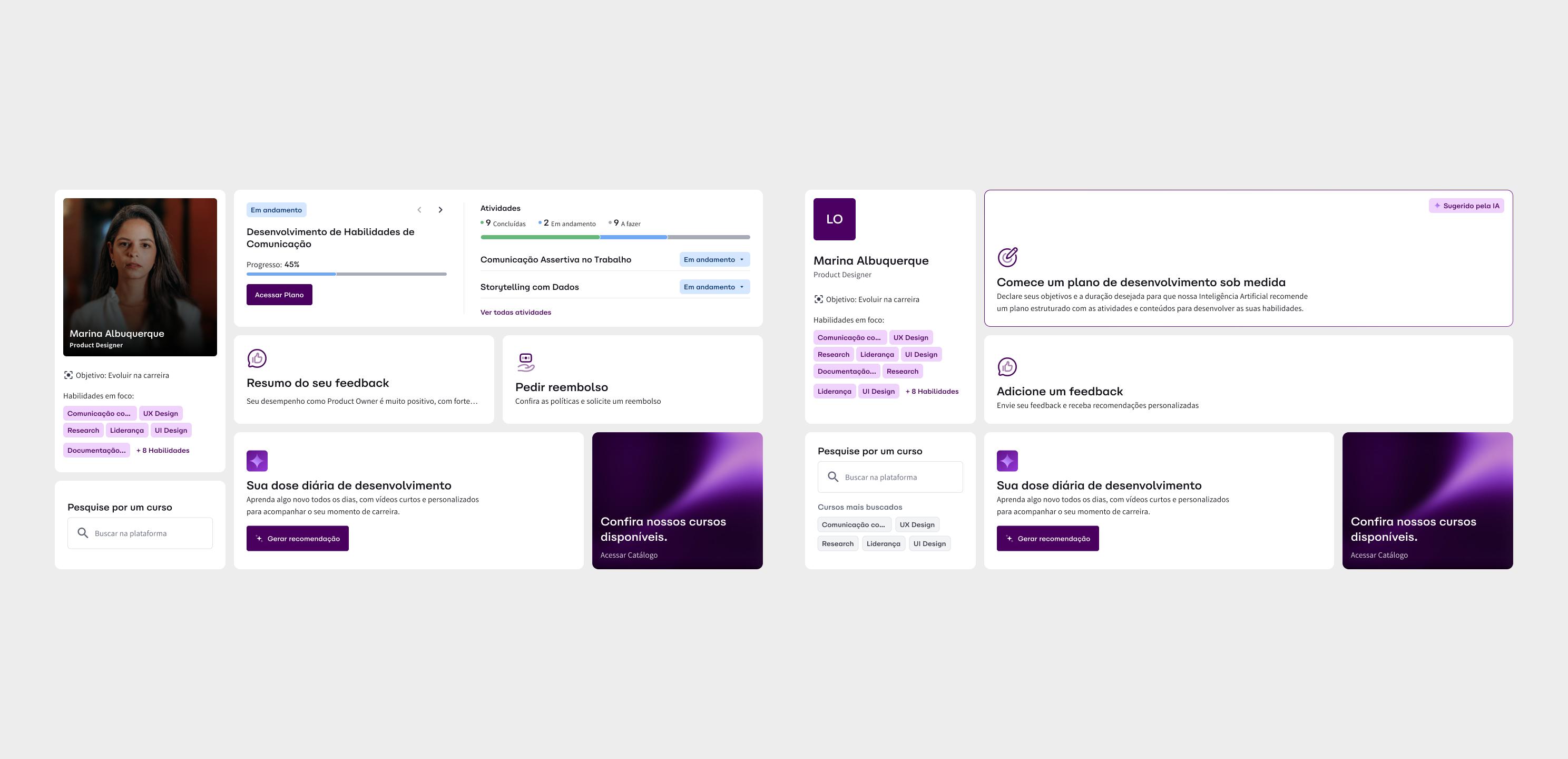
From course shelf to development dashboard
The home stopped being a course shelf and became a development dashboard.
It adapts to each company’s plan. A bento grid changes which cards appear and how big they are, based on the features the company has.
In the fullest version, it brings the personalized development plan, the daily knowledge dose, reimbursement requests, feedback updates, and the profile with desired skills, since the platform is skill-based. Last comes a button to the catalog. The courses are still one click away; they just stopped being the first thing people see.
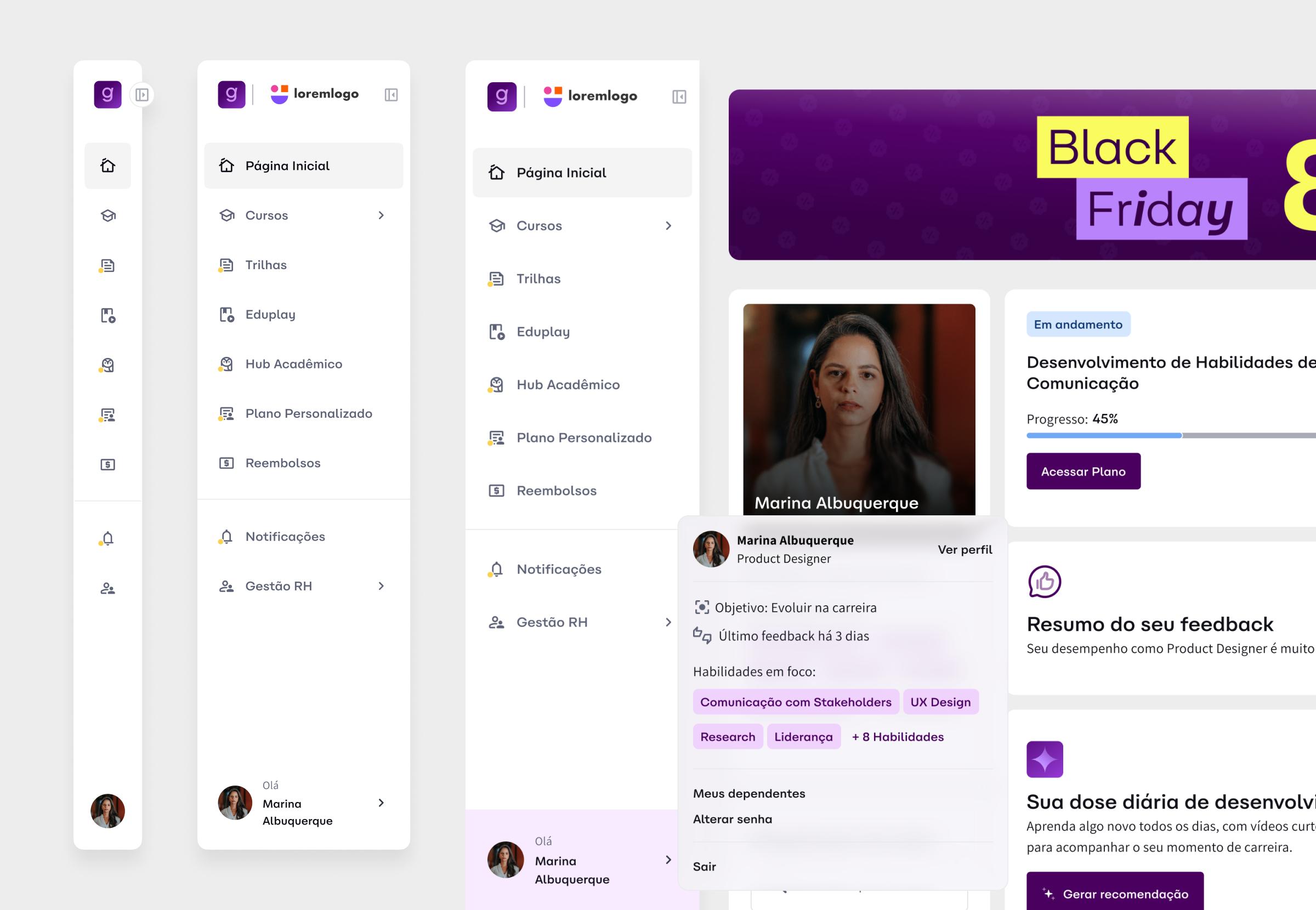
A sidebar that reads SaaS
Navigation moved to a side menu. It was a positioning call, made with the sale to HR in mind: Galena should look like the other SaaS tools HR teams already work with, not like a course marketplace.
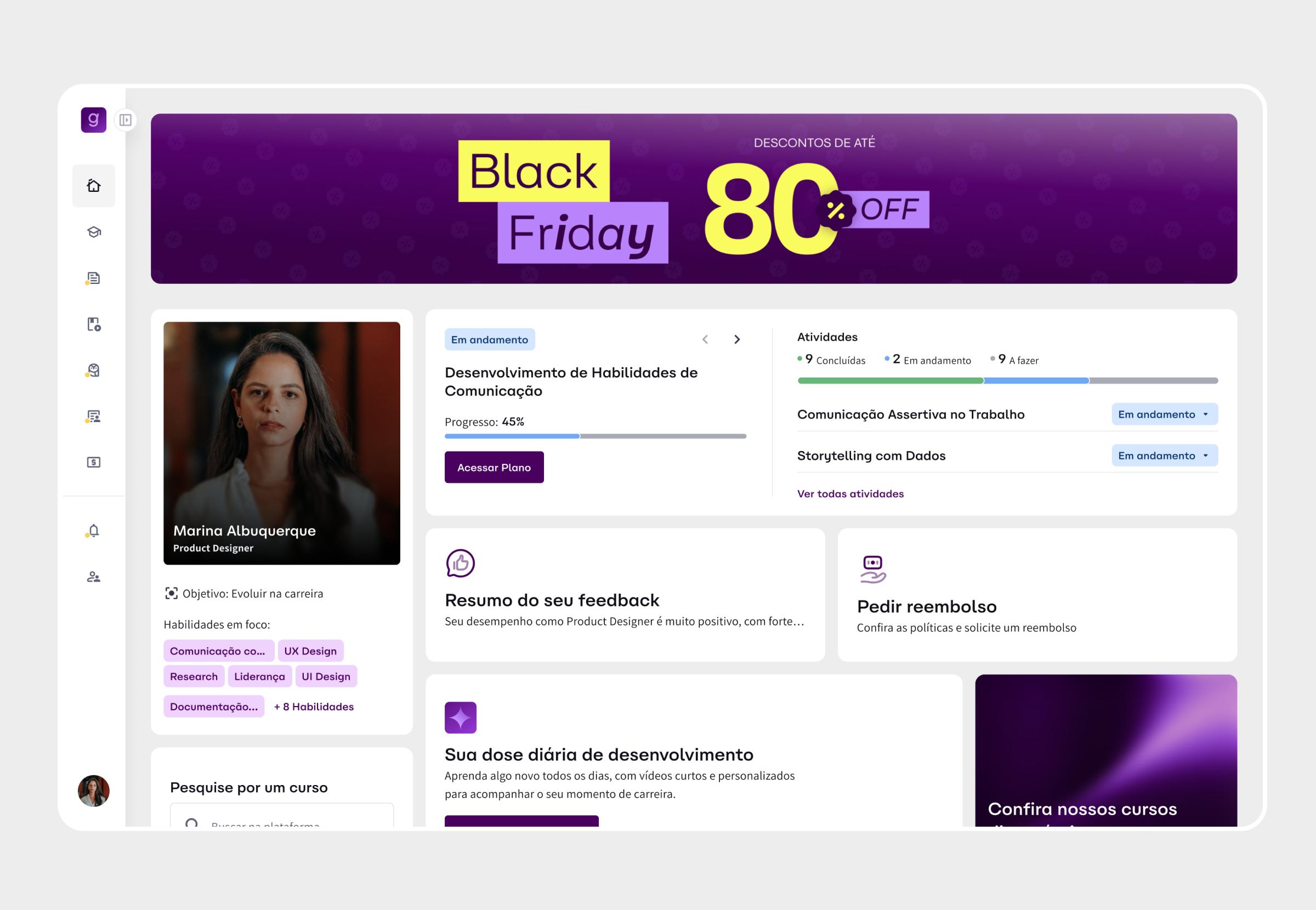
The banner I kept on purpose
The commercial banner stayed. It’s Galena’s main source of revenue.
It sits at the top, above the dashboard, so the two never fight for the same space.
Where it stands
- Implementation started, with the rollout to clients planned for January 2027.
- The baseline is in place. We measured the current cards and features, so we can see what changes when the new home goes live.
- Mixpanel already runs across the platform. After launch, I’ll track engagement with the individual development plan, the daily knowledge dose and catalog access, plus time on the home and the most-clicked items, and keep adjusting the home with that data.
Highlights
- Spotted the problem in usage data and turned it into a redesign proposal, with no request from leadership.
- Reframed the scope from adjusting cards to a full redesign of the home and the navigation.
- Designed an adaptive home that changes with each company’s plan, as the only product designer.
- Set the baseline and the metrics to track in Mixpanel after launch.